Start here
Templates
Landing, dashboard, and product page starters.
Browse templates →
Explore
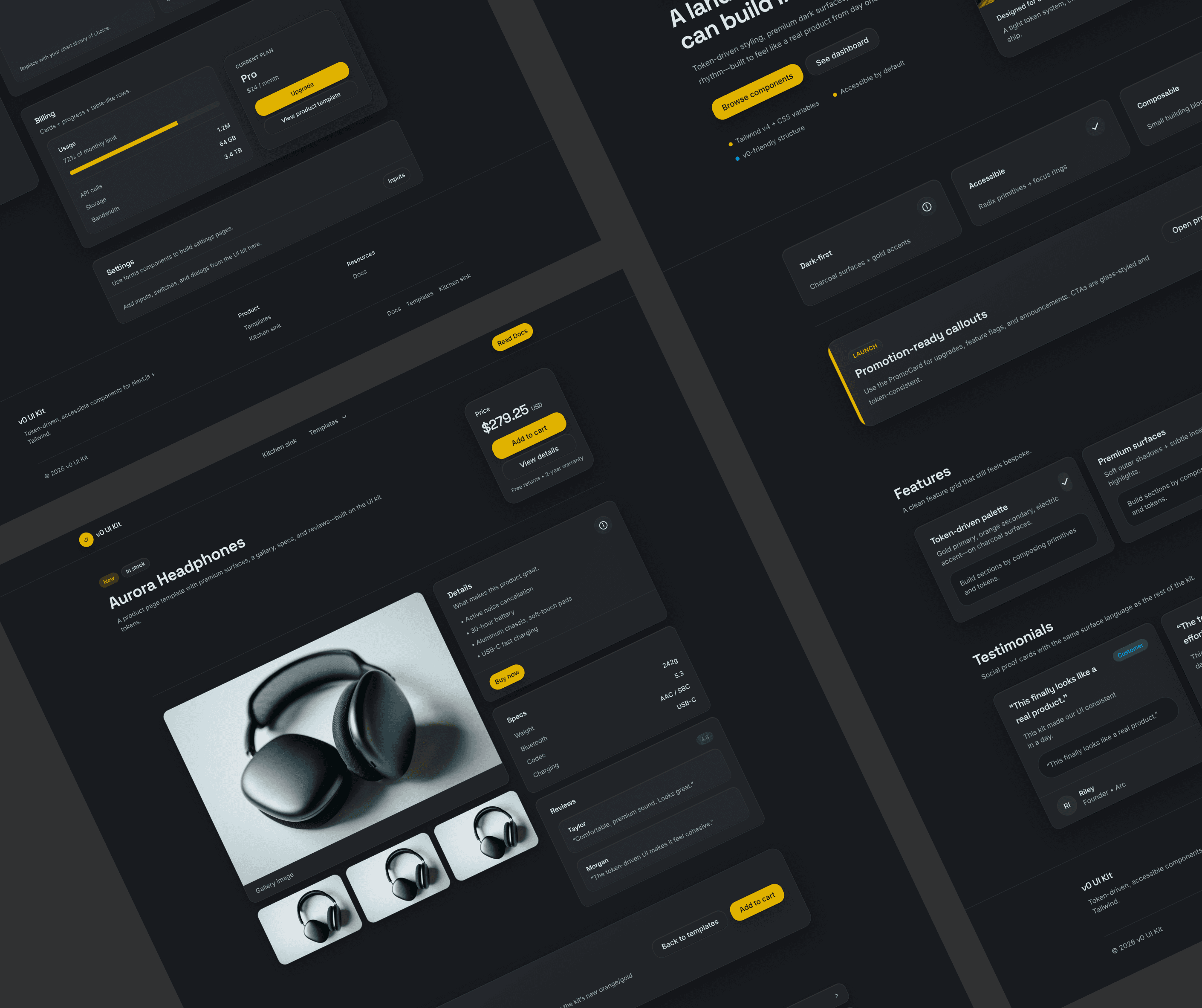
Kitchen sink
A comprehensive component demo page.
Open kitchen sink →
How to theme
Edit tokens
Update CSS variables in app/globals.css and every component updates automatically.
Tip: add .dark to preview dark mode.
Typography
Display font for headings, Inter for body, JetBrains Mono for code. Tailwind fontSize presets: h1–h6, body, small, tiny.
Headings
Heading 1
Heading 2
Heading 3
Heading 4
Heading 5
Heading 6
Body
This is body text. Build consistent rhythm using tokens and responsive primitives. Inline code cn(...) uses the mono font.
Small text for helper copy and metadata.
Tiny text for captions.
Color system
Primary, secondary, accent, neutral scales (50–900) + semantic colors. All colors are CSS variables with a light and dark token set.
Primary
50 → 900
50
100
200
300
400
500
600
700
800
900
Secondary
50 → 900
50
100
200
300
400
500
600
700
800
900
Accent
50 → 900
50
100
200
300
400
500
600
700
800
900
Neutral
50 → 900
50
100
200
300
400
500
600
700
800
900
Semantic
Success
Light / Default / Dark variants in tokens
Warning
Light / Default / Dark variants in tokens
Error
Light / Default / Dark variants in tokens
Info
Light / Default / Dark variants in tokens
Light + Dark support
Dark mode is driven by the .dark class. The preview below scopes dark tokens to a single panel.
Light
Dark
Inputs
Label, helper/error text, prefix/suffix icons, and size/variant presets.
We’ll never share your email.
3–24 characters.
Password must be at least 8 characters.
Cards
Container + header/body/footer building blocks. Variants: default, bordered, elevated.
Full-width promo card
A solid-background callout that uses the palette tokens. Great for announcements, upgrades, or high-emphasis CTAs.
Default card
A clean surface for grouping related UI.
Pro plan
$24 / month
Bordered card
A clean surface for grouping related UI.
Pro plan
$24 / month
Elevated card
A clean surface for grouping related UI.
Pro plan
$24 / month